Data Visualization: Row and Column Charts
Introduction
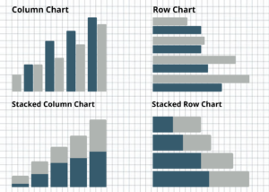
Row and Column bar charts are commonly used to visualize data when comparing certain data points, or endpoints, or show incremental differences between segments (to see which ones are larger or smaller, for instance). A row bar chart is oriented horizontally and is good for displaying large data sets, whereas a column chart is oriented vertically and is suitable for displaying datasets with negative values.
Uses
There are two ways to create a bar chart in Excel:
- Select your data table > Insert > Column (vertical) or Bar (horizontal) Chart
- Click on your pivot table > Insert > PivotChart. Using a pivot table makes it so any updates to the pivot table are reflected immediately on the chart without manual alterations.
To edit how the chart appears:
- Click or double-click on the chart and a Format Chart Area tab should appear on the right.
- Chart Options > Fill > No Fill or choose to make the chart background color (not recommended)
- Chart Options > Border > No line or Change the color, type, or width of the border line
- Click on the box around the graph > Format Plot Area > Fill > No fill
- Click on the box around the graph > Format Plot Area > Border > No line
- Click on bars (all or individually) > Chart Options > Fill > Color
- Click on bars (all or individually) > Chart Options > Border > No line or Change the color, type, or width of the border line
- Click on x-axis lines behind bars > Format Major Gridlines > Line > No Line or Change the color, type, or width
Practice
Using the World Bank Data, visualize each country’s commercial service imports, export, and GDP. What trends do you see?
Conclusion
Bar charts are a useful way to visually analyze and present a comparison of data points or incremental differences between segments.