Data Visualization: Bar Charts
Introduction
Bar or column charts are commonly used to visualize data when you want to compare certain data points, endpoints, or show incremental differences between segments (to see which ones are larger or smaller, for instance).
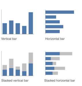
The most often used bar charts or graphs (graph and chart are typically used interchangeably) are: vertical bar, vertical stacked bar, waterfall, horizontal bar, and horizontal stacked bar charts. Bar charts are used across many professions and in academia to clearly present data to a specified audience.
- Vertical bar charts are used to compare data points in a variety of ways using a single, double or multiple series bar graph (be careful not to have too many series or else it will get overcrowded)
- Stacked vertical bar charts are best used to compare totals across categories or to see subcomponents within a particular category. These graphs can show absolute values or sum to 100%
- Waterfall charts pull apart the components of a stacked bar graph to focus on them one at a time, or to show a starting point, increases and decreases, and the resulting ending point
- Horizontal bar charts are the ideal option for comparing categorical data and they can also be shown using a single, double or multiple series bar graph (be sure to not to have too many series or else it will look overcrowded)
- Horizontal stacked bar charts are good to compare totals across different categories and to see subcomponents within a particular category. These charts can show absolute values or sum to 100% or scale, from negative to positive for example, allowing a comparison of the far left and far right data. Likert Scale data is often displayed using this type of chart
Uses
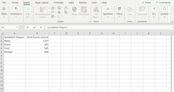
There are two ways to create a bar chart in Excel.
Select your data table > Insert > Column (vertical) or Bar (horizontal) Chart
Or
Click on your pivot table > Insert > PivotChart
Using a pivot table makes it so any updates to the pivot table are reflected immediately on the chart without manual alterations.
To edit how the chart appears, click or double click on the chart and a Format Chart Area tab should appear on the right. The options on this tab will change depending on where you click on the graph. For example, to change the location of the title or a legend, simply click on it and options for formatting will appear. Below are some of the formatting steps you can take.
Chart Options > Fill > No Fill or choose to make the chart background a color (not recommended)
Chart Options > Border > No line or Change the color, type, or width of border line
Click on the box around the graph > Format Plot Area > Fill > No fill
Click on the box around the graph > Format Plot Area > Border > No line
Click on bars (all or individually) > Chart Options > Fill > Color
Click on bars (all or individually) > Chart Options > Border > No line or Change the color, type, or width of border line
Click on x-axis lines behind bars > Format Major Gridlines > Line > No Line or Change the color, type, or width
Check out the Rules of Thumb of bar charts and general data visualization tips to learn more about formatting charts.
Here are some Rules of Thumb for bar chart formatting:
- Make sure the baseline, where the x- and y-axis meet in the bottom left corner, is at zero. If your graph starts at another point on the y-axis, for example ten, it can skew the interpretation of the chart
- Create an aesthetically pleasing graph by making sure the bars aren’t too thin or thick and that there’s enough white space between bars so that it is visually easy to differentiate the different bars (the width of the bars should be wider than the white space between the bars, but not too wide making it hard to compare)
- Be aware that stacked vertical and horizontal bar charts often become visually overwhelming, so do not use more than two colors and make the bar of focus stand out
- Logically order the bars from large to small, left to right, or up to down to depending on your audience’s most common reading pattern and how you wish to display your data
- Avoid using 3D bar graphs as this visual effect distorts the visualization of the data and can be distracting to the viewer and lessen the strength of the message you are trying to get across
More General Data visualization Rules of Thumb
Design
- Keep it simple and reduce clutter
- Remove gridlines if the audience would be able to follow the data without them (can leave them in if needed but make them thin and use a light color like gray so they don’t compete visually with the data); removing grid lines creates greater contrast, which makes the data stand (bar labels for example) if not necessary
- Clean up axis labels by simplifying numbers and abbreviating words (for example months), or removing them altogether if not necessary
- Remove the legend
- Avoid stereotypical colors for visualizations for gender data.
- Size can be used to attract attention or can show importance
- Use color sparingly and to highlight what you want the viewer to see and don’t change colors on the graph unless you want the audience to perceive a change
- Use shades of gray and pick a single bold color to draw attention where you want it to be; gray is a good base color and a good attention grabbing color is blue (prints well in black-and-white and can be seen by the color blind)
- Avoid shades of red and green as these are colors that colorblind people commonly have trouble seeing. If you need to use one of these colors for branding purposes, include an additional visual cue (ex. Bold, varying saturation or brightness, or adding plus or minus signs in front of numbers); can also use blue for positive and and orange for negative
- Highlight the important stuff, but only highlight at most 10% of a visual design
Visibility
- Remove chart border as they are usually unnecessary, use white space instead
- Label bars of data directly
- Use consistent color by making the data labels the same color as the data they describe
Typography
- Bold, italics, and underlining are used for titles, labels, captions, and short word sequences to differentiate elements; bolding is preferred over italics and underlining because it adds minimal noise to the design and is clear; italics add minimal noise, but don’t stand out as much as are less legible; underlining adds noise and compromises legibility
- CASE and typeface: uppercase text in short word sequences is easy to scan, which works well with titles, labels, and keywords; avoid using different fonts as a highlighting technique because it’s hard to attain a noticeable difference without disrupting aesthetics
Practice
Using the World Bank Data, visualize each country’s commercial service imports, export, and GDP. What trends do you see?
Conclusion
Bar charts are a useful way to visually analyze and present a comparison of data points or incremental differences between segments. These visualizations are used in a multitude of situations from highlighting income inequality between various socioeconomic groups to showing which athletic shoe company brought in the most revenue last year.