Statistics: Pivot Table
Introduction
Pivot Table is a powerful tool which highlights and dissects large data sets with the creation of a compact table. This table allows you to dynamically interact with the data to analyze and summarize different perspectives in a fast manner.
Functions
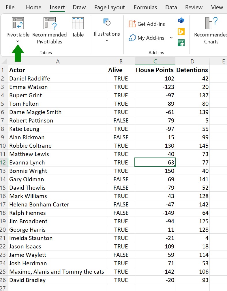
First, either select a single cell in the data set or the desired cells within a table or a data range.
Next select Pivot Table or choose Recommended Pivot Table from the Insert Tab.
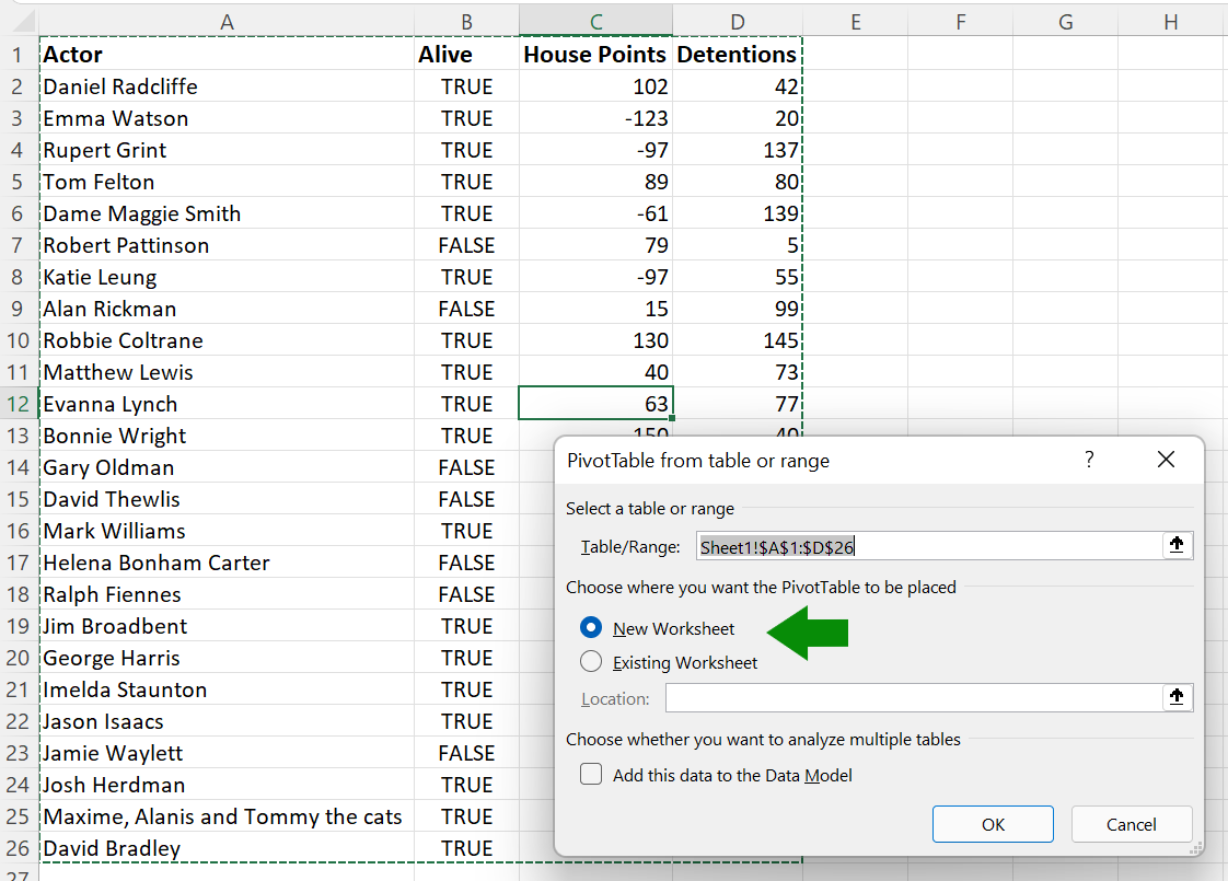
Once the Create Pivot Table Dialogue box is launched, Excel will automatically select the data analyzed. You may edit the range by typing in the correct range in the Table/Range box.
Then, choose where you want the pivot table to be located. The default setting is to create a new worksheet for the table. The other option is to select an existing worksheet where you may add the specific location for the table. Click OK when finished.
Pivot Table Fields
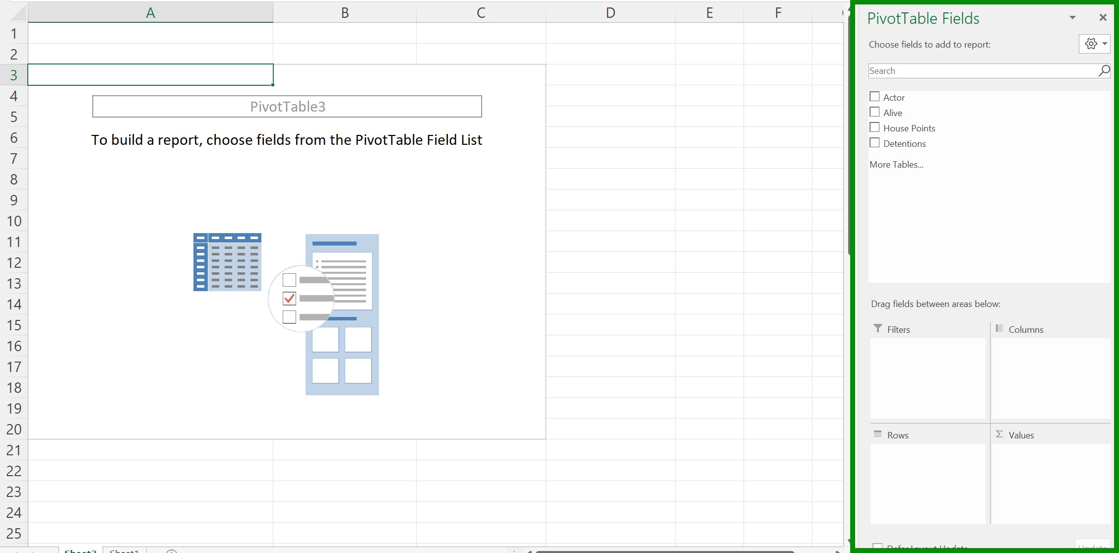
If you selected a new worksheet, a new one will be inserted into your workbook with an empty pivot table. The pivot table Fields Task Pane is located on the right of the window.
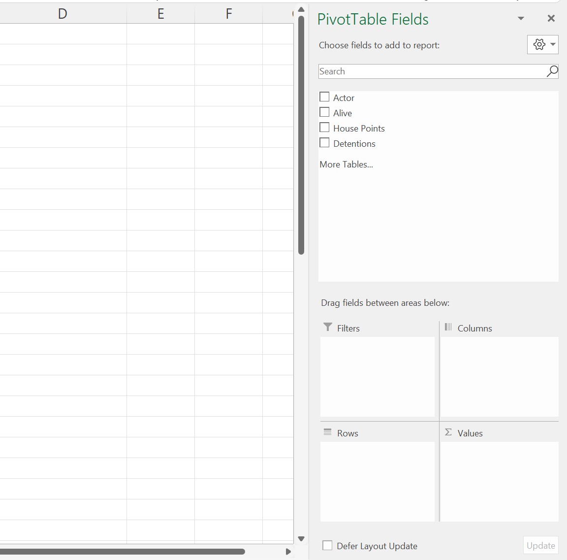
The Fields are the different columns in your original large data set. Check the desired boxes to add the fields to the PivotTable. The fields appear in the pivot table Areas below.
Selected fields appear automatically in the Rows Area. To organize the pivot table, click and drag the field names into the appropriate areas: Rows, Columns, Filters, and Sum of Values.
The Fields are the different columns in your original large data set. Check the desired boxes to add the fields to the pivot table. The fields appear in the pivot table Areas below.
Selected fields appear automatically in the Rows Area. To organize the pivot table, click and drag the field names into the appropriate areas: Rows, Columns, Filters, and Sum of Values.
Rows: Fields placed into this area appear as rows within the pivot table as the values you want as your observations. The chosen fields are listed in the order selected. The label listed first will be listed first on the pivot table. Row labels are derived from the field values.
Columns: Like the Rows Area, the fields dragged into this area appear as columns. The first column has the Rows Labels, whereas the subsequent columns contain the field labels. The columns reflect the order the fields are listed in the Columns area.
Filters: This area separates the observations according to the selected fields to look at each profile. For example, you can divide the values by time or country.
Sum of Values (Σ of values): This area determines the calculation or analysis used on the pivot table. Excel summarizes the data by default, either by summing or counting the items. However, you may change the desired calculation. This area will appear as the final column (and/or row in two-dimensional pivot tables).
Right click on a cell in the Sum of Values column. Select Value Field Settings. A dialogue box appears which allows you to select the calculation you want to use. Click OK after highlighting the correct calculation.
Practice
Practice using the pivot tables function by downloading the World Bank dataset and answering the questions below.
When looking at countries’ compulsory education levels, which number of years correlates with the highest average HCI values for those countries?
Conclusion
Pivot tables are useful and powerful tools to analyze data. Their multitude of uses allows you many possibilities to analyze and present big data.